

Design system of TEDxBrownU
Rebranding the visuals for TEDx at Brown University
In 2022, I joined TEDxBrownU at Brown University as an associate designer to redesign their landing page and establish a new design system. I created over 50 components, including input fields, buttons, date pickers, and text areas, all of which were implemented and published online. We held regular client meetings to ensure requirements were met, and I delivered high-fidelity mockups, collaborated with developers, and provided a software solution to enhance their process. The landing page was launched in May 2023, and the official webpage can be found here.
Time
Sep 2022 - May 2023
Team
Sunny Sun
(leader)
Tools
Figma
My role
Project Manager
Design system
User interviews
Landing page redesign
Highlights
Revamping the TEDx experience
I redesigned the landing page and crafted a versatile design system that elevated TEDxBrownU's online presence.
Define and research
Auditing the current experience

We began by auditing the current experience. The mission of the project is to redesign the website to convey "professionalism" and improve the overall reading experience. I recruited four students and conducted usability tests. Here are the key discoveries:

Landing page pre-design.
①
Low glancebility
All the text is bold and black, making it difficult to quickly absorb information and failing to emphasize key points.
②
Repetitive information
On the landing page, there are two CTA buttons labeled "Join Us". This redundancy increases cognitive load for incoming users.

Event page pre-design.
③
Require more information
2/4 interviewee claimed that this dropdown menu is hard to read as the text here is too bold.
④
Cognitive overload
4/4 interviewees stated that the speaker description contains too much text. One suggested focusing on the talk title and emphasizing key information.
⑤
Visual distraction
2/4 interviewee claimed that the background here could be made into a clean background instead to make it more readable.

About page pre-design.
⑥
Low impression
The current title is adequate but lacks the visual appeal to convey the club's mission at first glance. A more personalized and eye-catching title is needed.
⑦
Low glancebility
All 4 interviewees claimed that the description of TEDxBrownU has too much text. One interviewee suggested implementing a clear visual hierarchy.
Creating conSistency


Final experience
➀ Team page
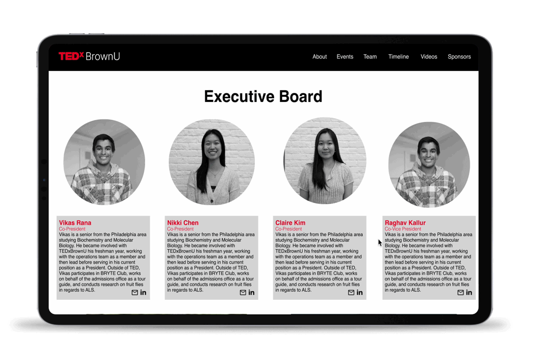
Unifying the colors and highlighting names with red, making the hierarchy more visually pleasing.
➁ Event page
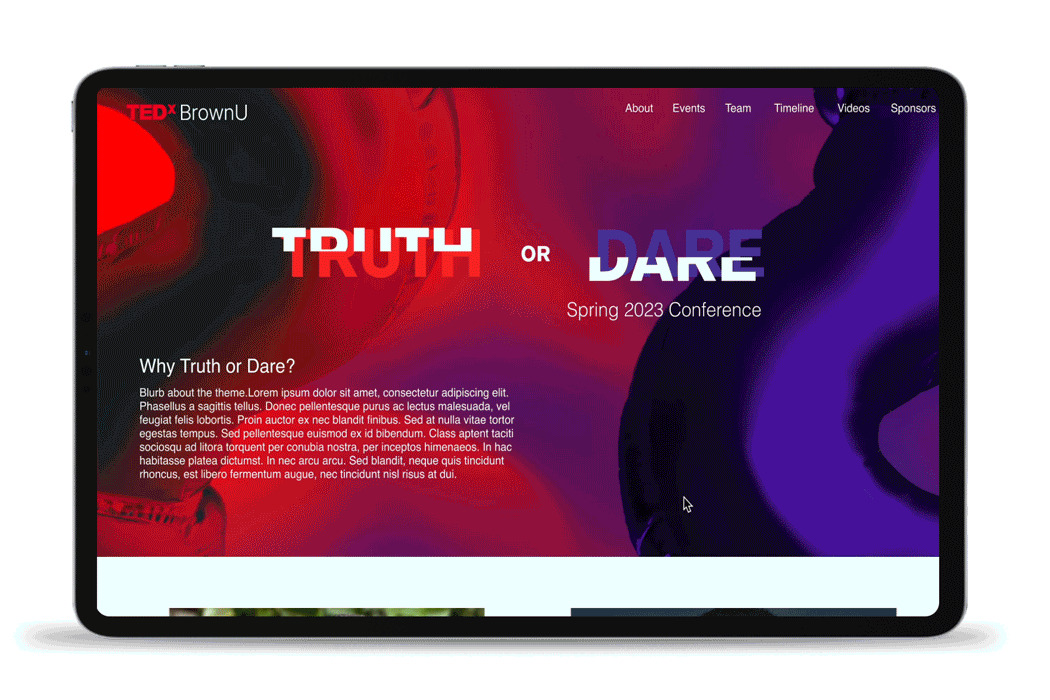
We added more information about the event of the year and highlighted the speakers who will be presenting. Additionally, we removed the background to reduce visual distractions.
➂ Home page
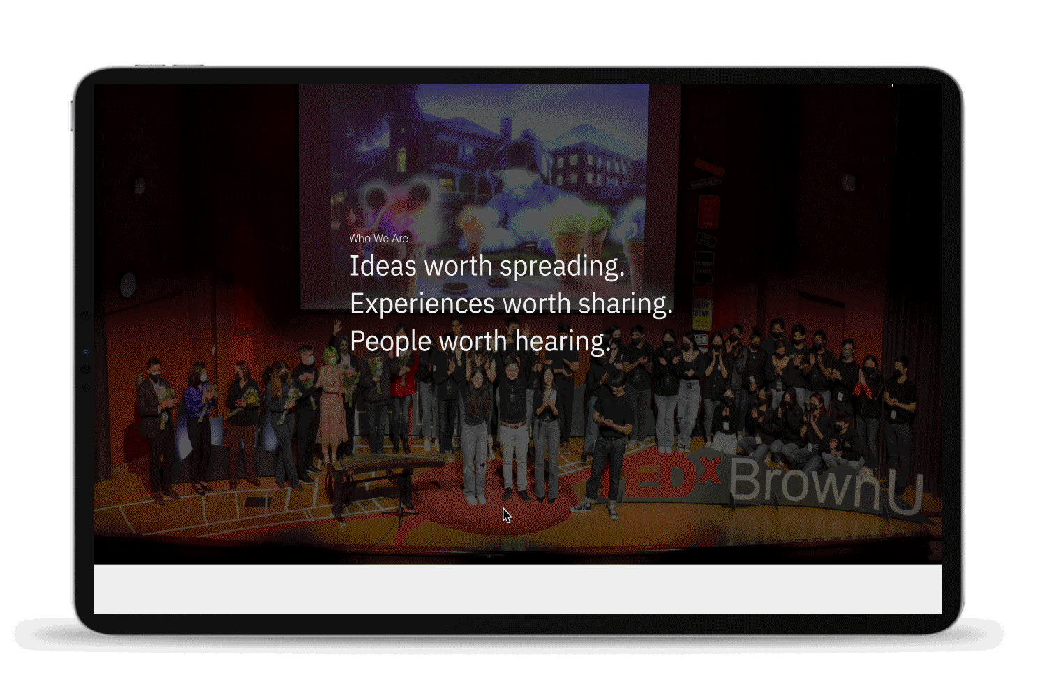
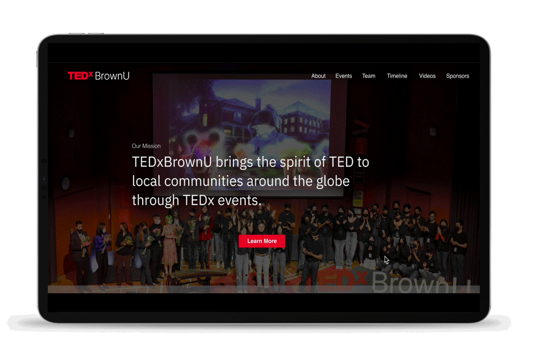
We added quantitative data to demonstrate our professionalism, including past events for easier navigation. Additionally, we provided more context in the hero section.
➂ About page
We removed chunky and low-glanceability text, replacing it with a more visually pleasing hierarchy by emphasizing titles in red. Additionally, we introduced the club's mission in the title as an eye-catcher.
