Amazon 2022
Crafting interactive onboarding tour for managers
During my 2022 internship at Amazon Global Talent Management and Compensation (GTMC) team, I designed from 0-1 an efficient onboarding system for internal promotion products for 130k+ managers.
I have worked with a team of 2 PMs, 1 UX writer, and 1 UX researcher to host regular meetings to ensure business needs were met. I have also conducted interviews independently, create more than 200+ high-fid screens, crafted user journey and present my design to higher level designer teams.
At the end of the internship, I have designed flexible component/pattern that could be used in other GTMC products.
Time
Jun 2022 - July 2022
Team
UX writer (Angela)
User researcher (Rezvan)
PM (Jake & Jodi)
Mentor (Rebekah)
Tools
Figma
Miro
Quip
My role
User flows
Thematic analysis
Functional prototypes
User testing
Design system
Background
For the internship at Amazon 2022, I worked on Amazon's internal promotion platform ---- Promote.
We discovered that new managers took too long to learn the promotion process, which could lead to career stagnancy for employees.
Hence, my mission is to design an experience such that managers can learn the promotion process faster.


My role
Designing from 0-1
I led the end-to-end design of the onboarding experience during my internship, from ideation to presenting to senior management. I collaborated with a Researcher, UX Writer, and Product Managers, aligning progress through weekly meetings.

The challenge
How might we help new managers learn the promotion process and tool faster so that their employees get promoted more quickly?
In 2022, employee dissatisfaction hit 65%, largely due to new managers delaying promotions. Our goal is to accelerate manager training to enable timely promotions.
The solution
Onboard managers with interactive tour and key guidance
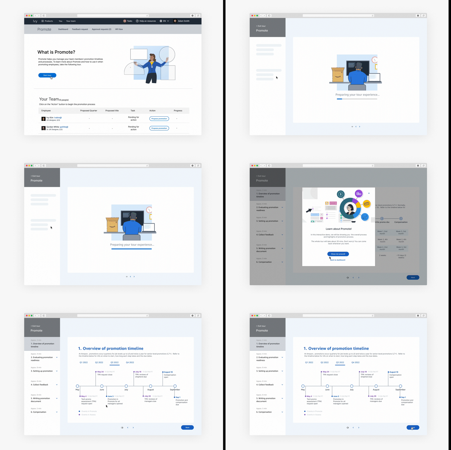
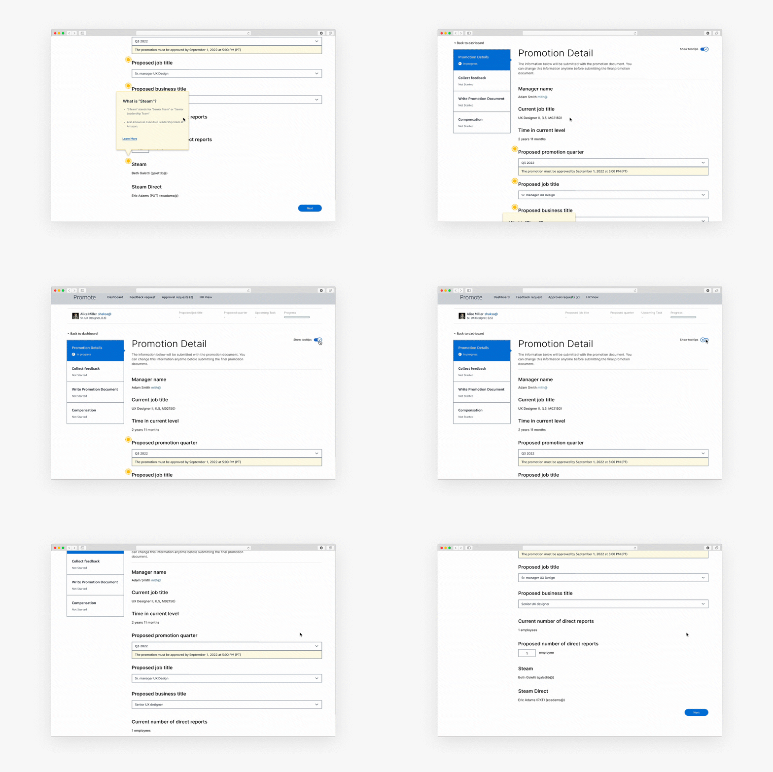
I designed an interactive tour on the homepage to guide managers through the promotion process. Additionally, I implemented a toggle button across the experience to provide on-demand tooltips for enhanced clarity.
01/
Promotion process in a glance
A clear navigation bar on the left synthesizes key steps in the promotion process, while the timeline overview highlights important milestones.
02/
In-product tool tips for confusing terms
To address confusing tech terms, the tour includes tooltips that help managers understand their meanings.

03/
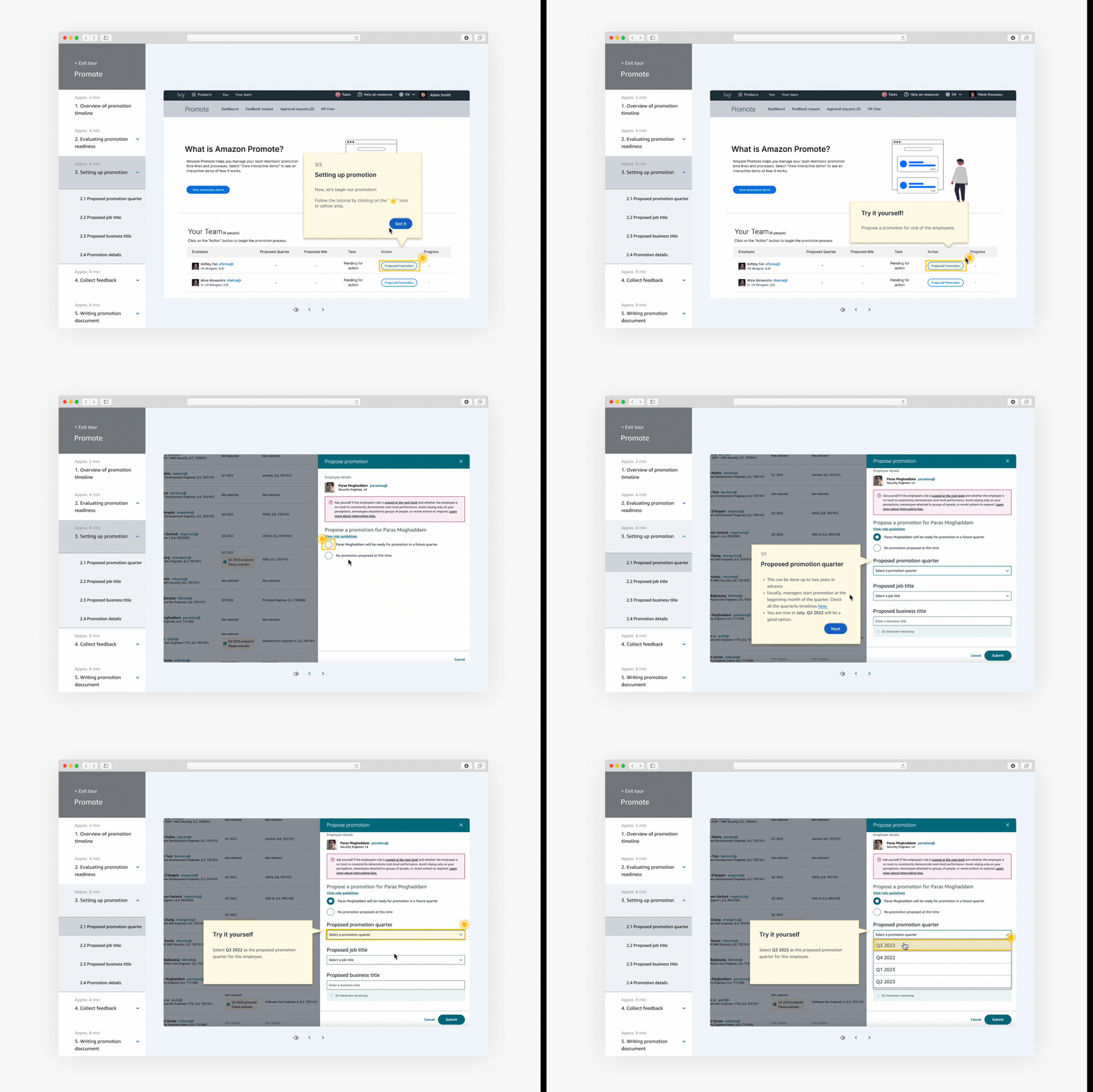
Try it yourself to get familiar
Enables managers to explore and familiarize themselves with the tool's functionalities.
Impact
Launched and improved task success rate
Following the internship, the team successfully launched the features. Additionally, the tooltip component was integrated into the Stencil Figma design system, which is now utilized by hundreds of UX designers.

Research
Meet our users
The target users of the project is managers with the following traits. With the background info in mind, I started my journey into the research phase.
1. Have never used internal promotion tools before
2. Have less than 6 months of total Amazon tanure
2. Ranging from L5-L7

Qualitative data from the 8 contextual interviews
To understand the slow promotion process, I partnered with a UX researcher to create an interview script for contextual interviews with 8 managers lacking promotion experience. We asked them to navigate the tool and share what was missing. Key insights include:

User journey mapping
In addition to the key problems, I have also mapped out a user journey to help me identify when do managers encounter the most frustrations.

Ideation
Finding ideas in comparative analysis
Hence, I have started off with competitive analysis to not only get inspiration, but also determine the common tips that can help users onboard, such as providing a tooltip and having video tutorials.

Blocker
Long-term or short-term solution?
As I am brainstorming, I have a huge blocker. For the key problems identified, there can be a short-term fix and long-term solutions. To decide which one is the right direction, I was confused.


Finding solutions through Feature prioritization
Step 1
Individual Efforts-value charts
I have asked PMs to put each of the features into the effort-value charts. In such a way I can get a sense of what feature should be prioritized.

Step 2
Compare and group
Then, I have organized all the feedbacks into a compiled matrix. Here, I will be choosing features from higher efforts and high customer values.

Design
Initial design
After I had determined the direction, I immediately jump to high fidelity. Since Amazon GTMC has their own design system (Stencil), I just leveraged their assets as the base for my initial design.

Iteration
An adjustments to navigation and flow
After finishing the first design, I have set up meetings my managers and mentors to gain feedbacks. There has been some issues with confusing navigation bars. Hence, In iteration 1, I have adjusted the navigation bar.

Iteration 2
Personality and tone adjustments
I also scheduled meetings with the creative director and UX writers to gather insights on the dashboard, loading screens, and more. Aside from minor color adjustments, they recommended adding more personality to the products.


Retrospective
My key learnings
01/
Each person has valuable knowledge to offer
I worked with a user researcher and learned how to ask better questions. I also learned from the design team how to use UX best practices to improve the usability and understandability of the tools. Each person plays an essential role and has a bundle of knowledge to offer, so it's important to always be curious.
02/
Make informed design decision
Design choices must be backed up by reason, and every choice you make should be deliberate. Good UX design stems from empathizing with the user, so it is extremely important to do research before you have your design. In this project, I have used data and analytics to better understand the user. They support why I made a design choice.
Next step
Success metrics
Before leaving my internship at Amazon in 2022, I noted key success metrics to measure the effectiveness of the experience.
01/
Short term (before implement)
1. Task success rate - A comparison of the task completion rates among new managers before and after the experience.
2. First time task success rate - A task success rate of over 80% for new managers completing individual tasks for the first time.
02/
Long term (after implement)
1. Reduction in tasks time - Clickstream analysis indicates a need to reduce the time spent on completing individual tasks.
2. Reduction in dwell time - A reduction in dwell time of employees with new managers, This will be measured quarterly.


